Overhauling a Brand’s Visual Identity to Support a Strategic Market Shift
Project
Client
Industry
My role
- Brand Designer
- Marketing Graphic Designer
What I delivered
- New visual identity standards and guidelines
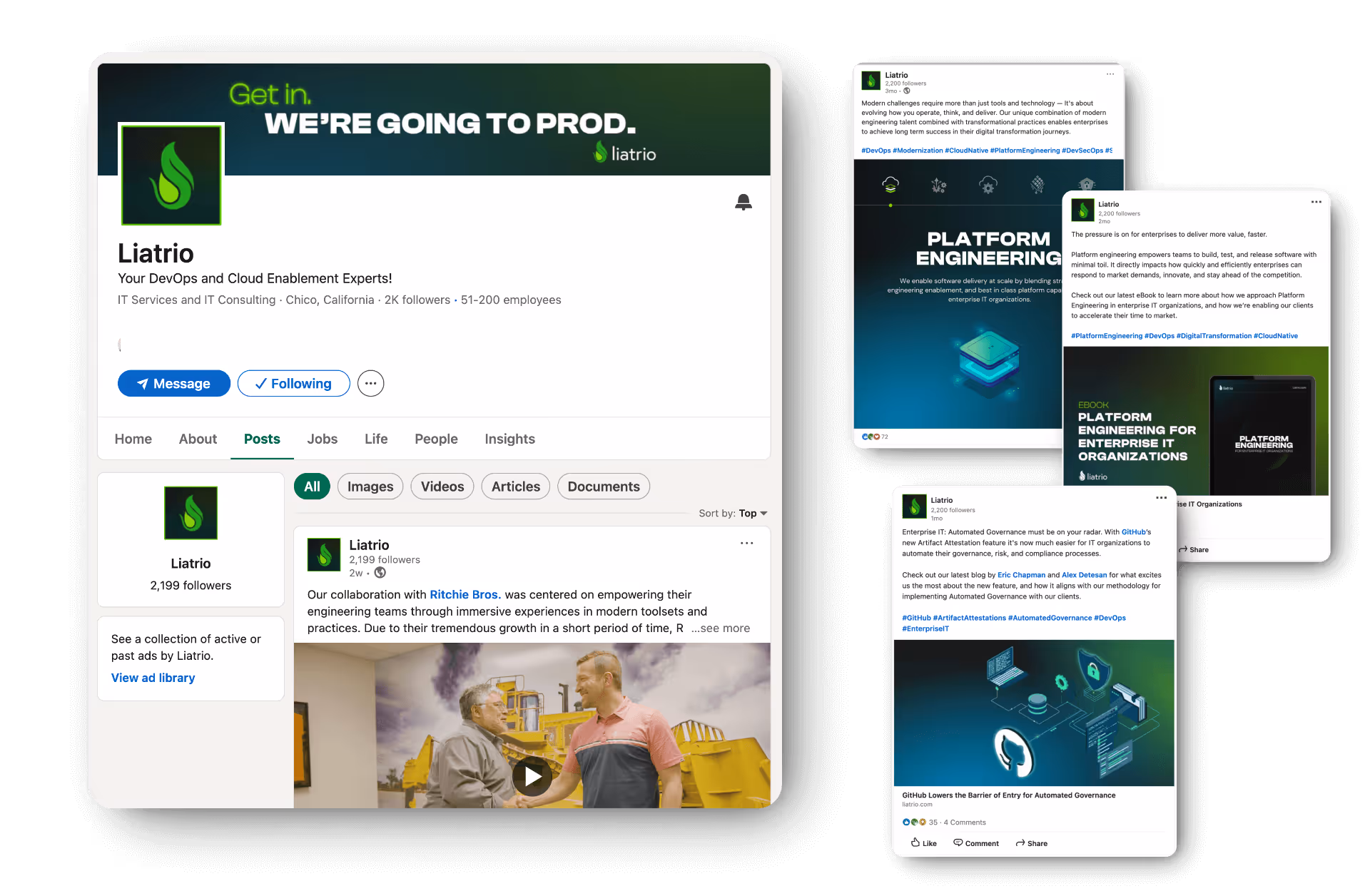
- Graphics assets for marketing and sales content and channels
Summary
Liatrio is a DevOps consultancy that helps enterprise-level companies rethink their technology practices, IT culture, and ways of working. In late 2023, the company shifted its brand strategy to reflect major changes in the industry, especially around AI adoption. A new brand identity and website were key parts of that transition.
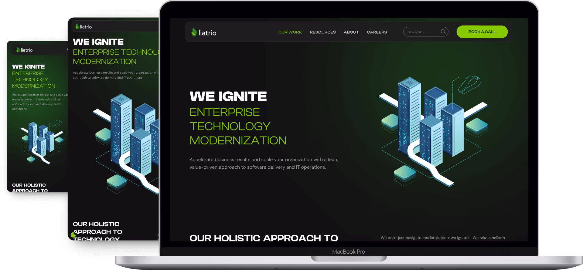
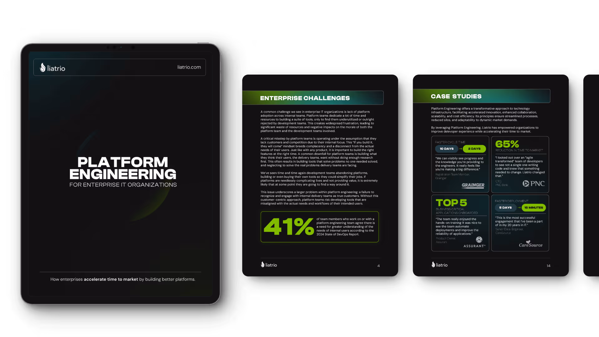
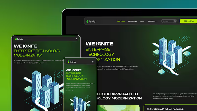
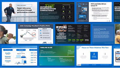
Within just four months, I worked with a colleague to overhaul the company’s visual identity and website [view the website showcase], and integrated the new identity into marketing content and social media channels.
Design Constraints
When the project started I’d been up to that point Liatrio’s first and only in-house designer, and I knew the brand’s core values in and out. So they trusted me with full creative freedom to reinvent the identity I’d inherited from 4 years prior when I was hired. They only gave me two hard constraints:
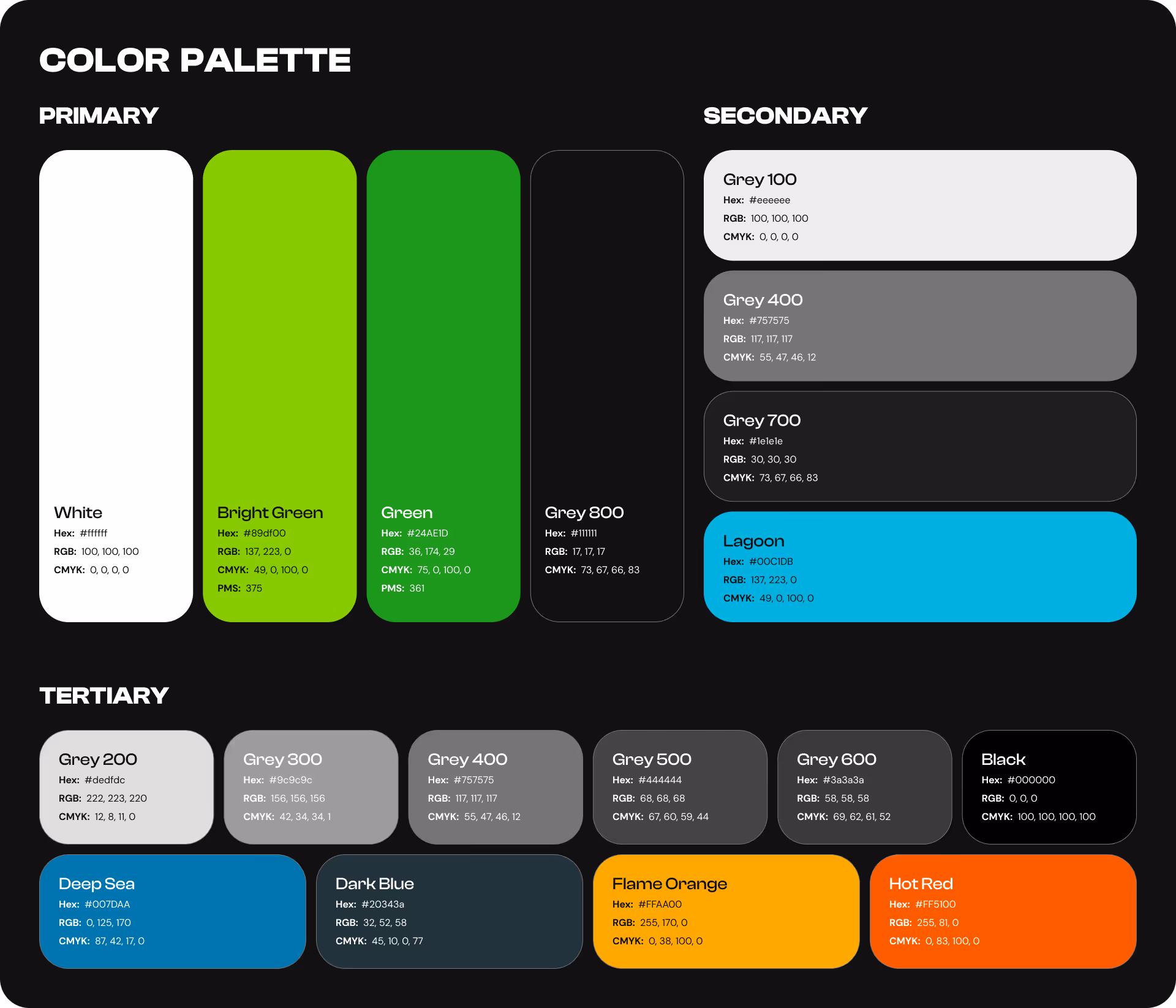
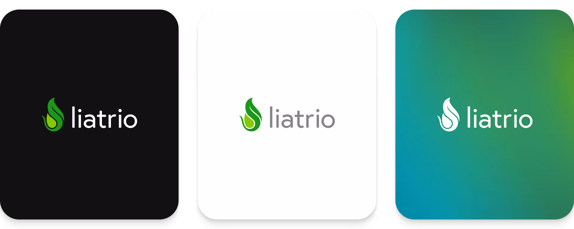
- Keep the original logo, logomark, and the core brand colors — green and bright green
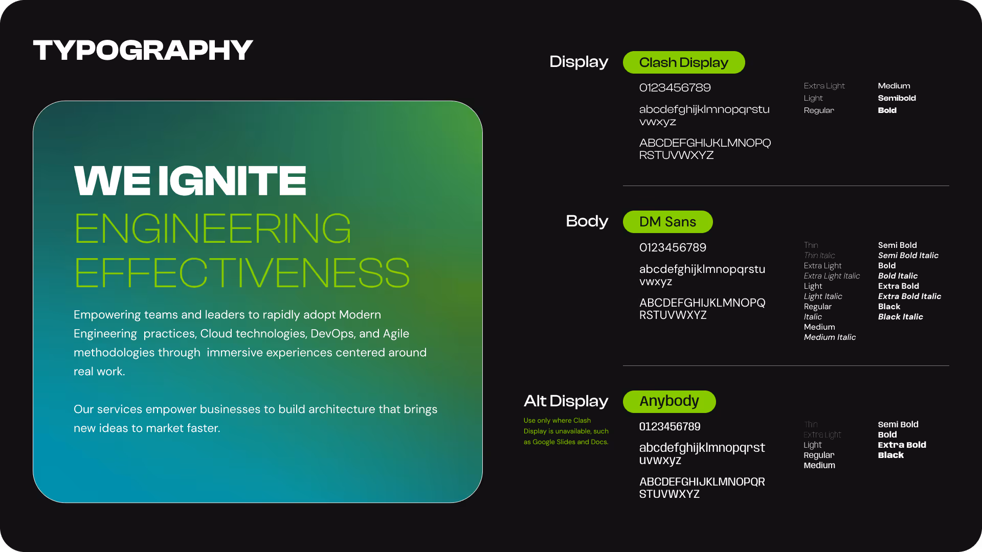
- Any typeface changes had to be compatible with Google Suite, the company's main productivity & collaboration tool
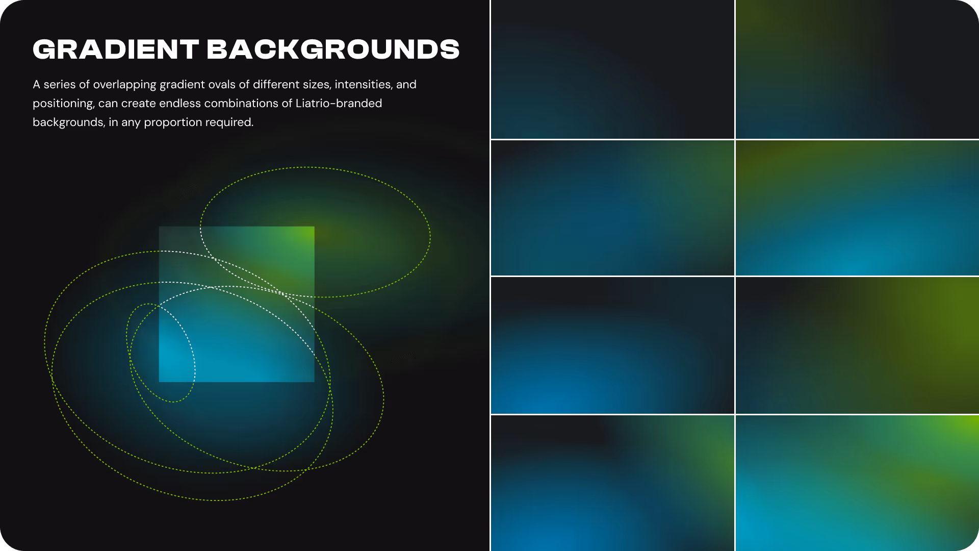
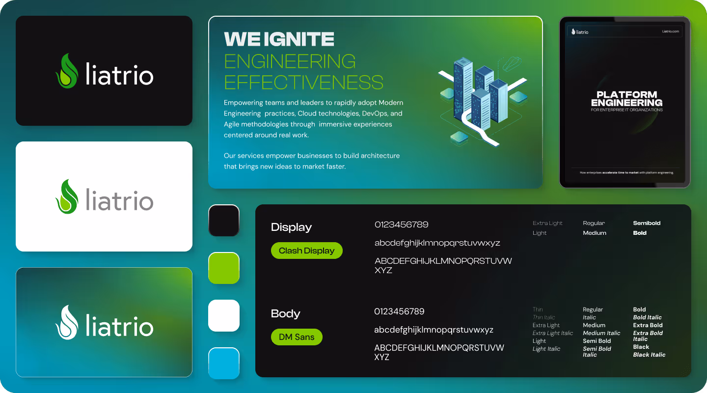
Liatrio Brand 2.0
Using the website refresh as the design vehicle, I created a high contrast technology forward visual identity that reflected Liatrio’s new brand positioning:
- A dark mode-first palette, with the logo’s bright green as the primary brand color
- Large, 900-weight black display type, with a Google-compatible fallback
- A low contrast body typeface for long-form content
- A simple yet robust gradient pattern system to add visual contrast
- Custom icons limited to shades of grey and brand green
- A library of stock graphic assets to build custom supporting illustrations